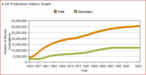
The Oil Production History Graph is actually two separate graphs constructed from the field data in the Oil Production History Table. It is important to know that the Secondary Production is an estimate for the entire field, but the entire field may not subject to enhanced recovery. Consequently, the secondary and total curves of the graphs may not be directly related to each other.
Example Screen Clip—Annual Cumulative Total and Secondary Oil Production:
The upper graph shows Total Annual Cumulative Oil Production for the subject oil field (orange) and Total Annual Cumulative Secondary Oil Production (green). The area beneath the green line represents Estimated Secondary Oil Production. The area between the orange and green lines represents Estimated Primary Oil Production.
Example Screen Clip—Annual Total and Secondary Oil Production:
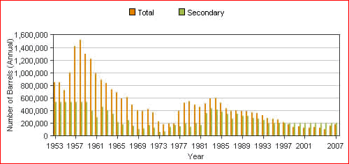
The lower graph shows the Annual Total Oil Production and the Annual Total Estimated Secondary Production. Note that the Secondary Oil Production is effectively shown twice, alone as the secondary bars (green) and also as a component of part of the Total Production bars (orange).